
Introduction
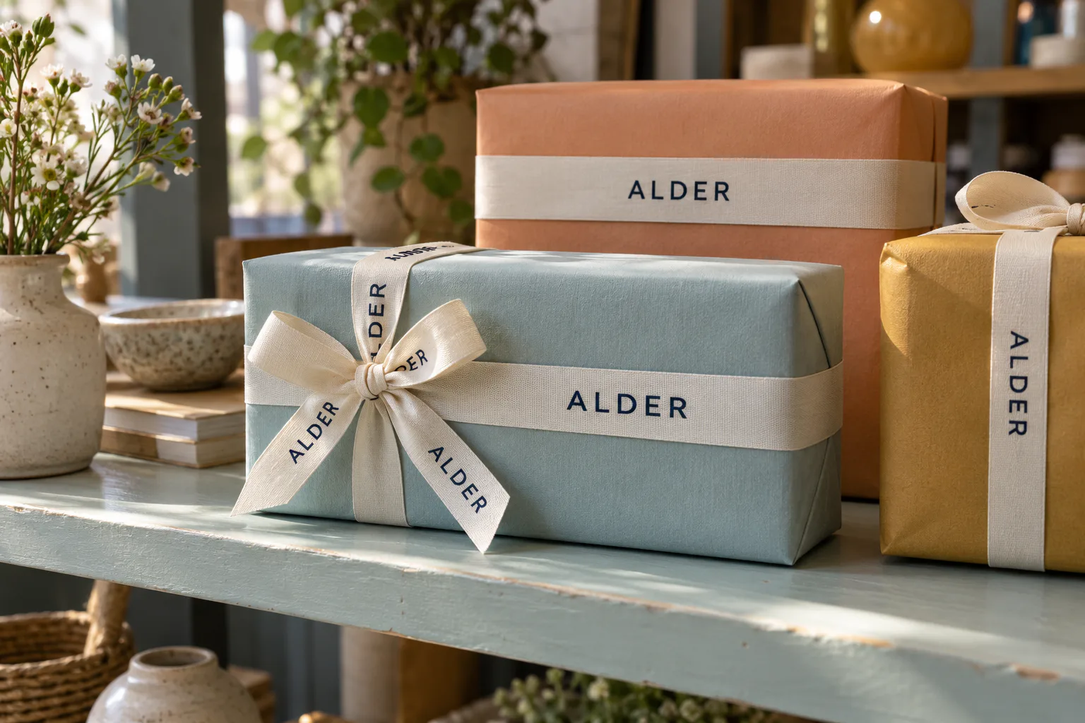
A neat design on a flat strip can lose its main word inside a knot. A centered logo on the first box can move toward the edge on the next. These are layout problems you can solve before printing. The names and dimensions below are design examples, used to show the choices.
Choose the main message first
Give the ribbon one clear priority: the business name, the recipient, the occasion or a decorative pattern. On a plain box, the brand name may need to carry the identity. On a box already printed with a large logo, a smaller symbol or an all-over pattern may be enough.
Put the proposed design beside the package before adding a slogan, website or social handle. If the main name already fills the usable space, adding more copy means smaller lettering. Keep longer information on the packaging or card instead of shrinking everything to fit.
Decide whether the design should repeat
The first layout decision is whether the design can repeat freely or must land in one particular place. That choice affects how the ribbon will be cut and assembled.
Design approach | A useful starting point | What to check on the finished item |
|---|---|---|
Repeating logo or short message | Branded gift wrap, bags and boxes | One complete name or logo remains visible after folding and tying |
One complete message in a planned position | Names on a favor, wording on a sash or ceremony ribbon | The cut, fastening and orientation keep the whole message in that position |
Continuous decorative pattern | Bows, layered tails and seasonal decoration | Partial motifs at folds and cut ends still look intentional |
For fixed placement, show the supplier where the message must sit and how the piece will be used. A repeating roll is flexible for varied packages; it does not automatically center a logo on every box.
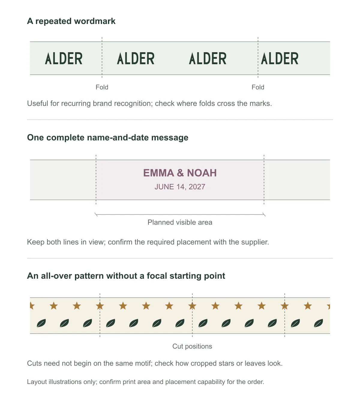
A repeating brand mark, a complete personal message and an all-over pattern require different checks. Keep the necessary words together, and judge decorative cuts by how the cropped motifs look.
Gift boxes: fit the message into the visible space
A box has 120 mm of straight ribbon visible on its lid. The proposed name and tagline take up 180 mm along the ribbon. They cannot both sit flat in that space: some of the wording will turn over an edge or disappear beneath the bow.
Let the fictional brand name ALDER occupy 60 mm on its own. Centering it in the 120 mm section leaves 30 mm at each end. For a package whose main job is to identify the brand, this is the stronger starting point: the full name is visible before the gift is opened.
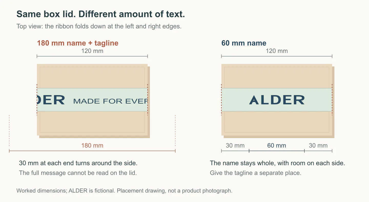
The same visible space, with different content. Keeping the 60 mm wordmark together leaves 30 mm on either side within this 120 mm section. ALDER is a fictional design example.
If the tagline must stay, try a longer unobstructed route across the box or a second visible section. Shrinking the whole 180 mm group to 120 mm reduces every element to two-thirds of its original size, including the smallest letters. Print that reduced version at actual size before deciding it solves the problem.
If the name must be centered on every lid, mark its position on a wrapped example and record where the ribbon starts, folds and is cut. The repeat and cutting section below explains why cutting equal lengths is not enough.
Look at the whole closed box. A ribbon band may clear the product label while its bow still covers it. Move the bow or ribbon away from the label if the customer needs it to identify the contents.
Wedding favors: keep names out of the knot
For a favor marked Emma & Noah — June 14, 2027, the full names are part of the keepsake. A flat band across the front gives that group a place to remain together. A bow has a knot, two loops and tails facing different directions; the same line may be split among all of them.
Choose the flat band when both names must be readable at a glance. If the bow is the main feature, reserve an exposed tail for the wording and leave the knot area blank. Tie one favor, mark the visible tail, then place the text within that area.
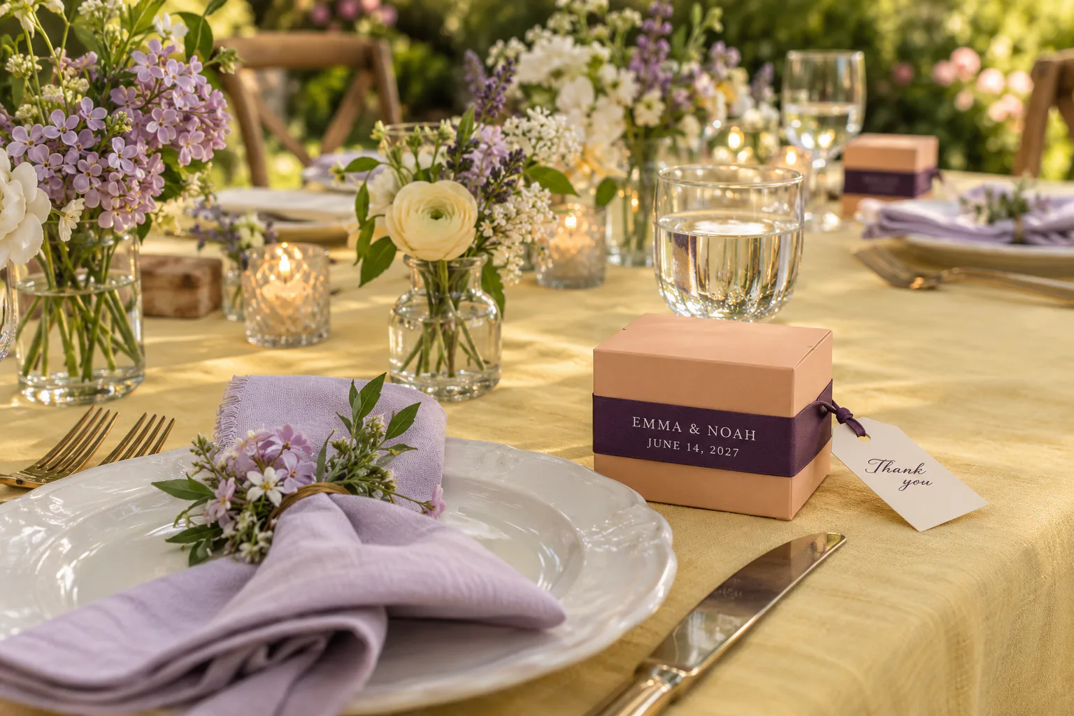
Design example: the names and date share the flat front band; the thank-you message has its own tag.
Write the month as a word for an international guest list: June 14, 2027 or 14 June 2027 avoids the ambiguity of an all-numeric date. For individual place settings, guest names need a separate personalization plan; one repeat with the couple’s names cannot identify every seat.
Personal gifts: separate the greeting from the recipient's name
The real gift photo below shows another approach: one message on each bow tail, both below the knot. A birthday or graduation gift can use one tail for a short greeting and the other for the recipient’s name. Give each message its own visible length rather than running one sentence through the knot.
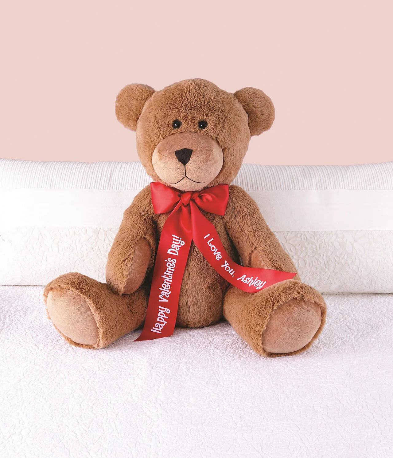
Two separate messages sit below the knot on the visible tails of this personalized gift. Photo: Personal Creations, CC BY 2.0; source.

Bouquets: design the handle wrap and hanging tails separately
A florist’s repeated name or symbol can work on the handle wrap, where the ribbon is seen in short sections around the stems. A longer message needs an exposed tail. Treat those as two separate areas of the design, even when they use the same ribbon.
Draw the bouquet upright. Mark the top and outward face of each tail, then choose whether the words run down the length or read across it. Show both tails on the sketch: mirroring one tail onto the other may turn a word the wrong way.
Lift the tied bouquet before approving the position. A tail that lies neatly on a table may twist when it hangs. If the first word disappears beneath the knot, move the message farther down; if the entire tail turns inward, change the attachment or tying method. Separate printed tails can be considered when the handle wrap cannot produce the required position.
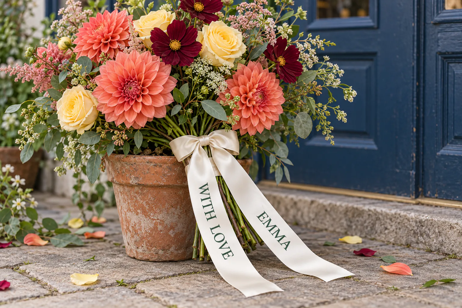
Design example: each message follows its own tail, with blank fabric beside the knot and cut ends. Check the reading direction again when the bouquet is lifted.
Judge the lettering against the flowers and wrapping, too. Pale text on pale ribbon can disappear in a bright bouquet. The message should be readable when someone receives the flowers, without holding the tail flat.
Event ribbons: plan for the audience and the cut
At an entrance, give the event name the strongest position and size. Place the organizer and sponsor group around that priority, following any logo-use commitments. Making every mark equally large can leave the main message hard to find.
Draw the span people will actually see between posts, flowers or people holding the ends. Place the main wording inside it and view a full-size paper mockup from the audience position. A message that reads well on a gift-bag tie held in the hand may be too small at an entrance.

Repeated lettering remains visible along different parts of a long ribbon at a store opening in The Villages, Florida. Photo: Whoisjohngalt, CC BY-SA 4.0; source.

Compare the approved logos as a group. Equal widths do not make a wide wordmark and a compact symbol look equally prominent. Give the smallest required wording enough room to be read before adding decorative details.
For a ribbon cutting, mark the cut point as well. If a complete event name will be kept as a souvenir, place it on the retained section, away from the cut. Plan the photograph, the cutting moment and the saved piece together; they may show different parts of the ribbon.
Crossed awareness ribbons: check the shape after folding
Fold a blank strip into the crossed shape, mark the exposed legs, then unfold it to position the print. The overlap hides part of the strip and changes how each leg faces. A short name or symbol can fit an exposed leg; the full campaign explanation usually needs more space than this folded shape provides.
Decorative patterns: decide what can be interrupted
Small scattered stars, dots or leaves tolerate partial motifs at folds and ends because the overall pattern continues. A large flower or numbered anniversary emblem is different: cutting through its center may remove the detail that makes it recognizable. Choose small scattered motifs when flexible cutting matters; reserve complete motifs when their identity matters more.
Directional patterns need a top and bottom. Trees or figures may stand upright on one side of a package and turn upside down on another. Follow the entire wrapping route. For a ribbon used across many box shapes, a pattern without a strong direction is easier to place.
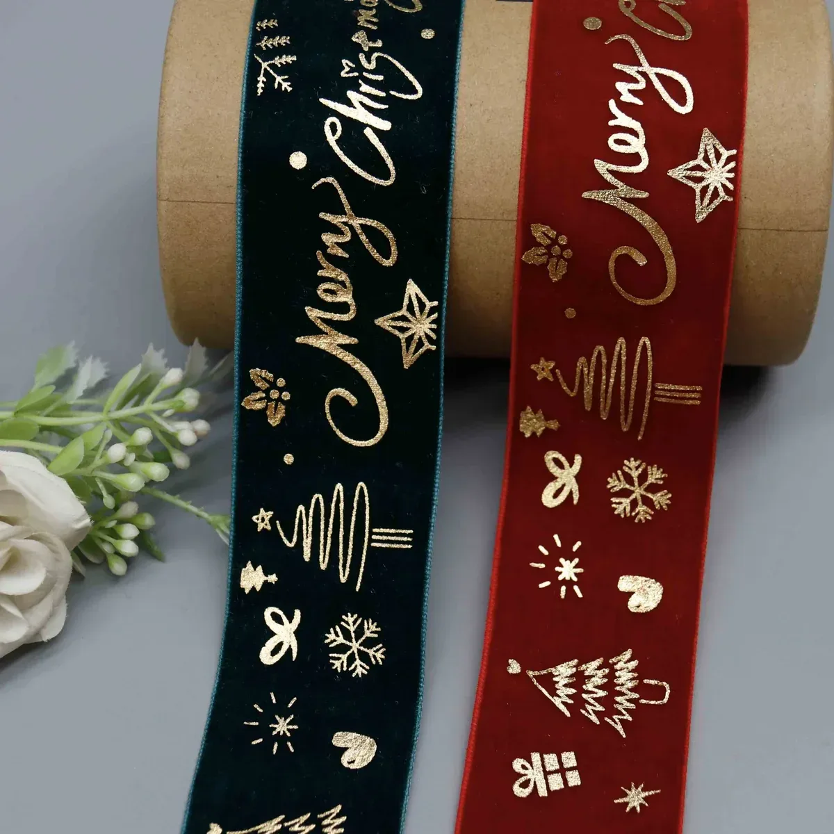
The YiTuo HD26731-23 velvet design alternates Christmas lettering and festive motifs. On a wrapped package, the words need a more deliberate position than the small decorative elements.
Specify the repeat and the blank space separately
Repeat length runs from one point in a design to the same point in the next copy. It includes the artwork and the space after it. Clear gap is only the empty space between designs. Label both on the drawing instead of calling them both “spacing.”
On 25 mm ribbon, a mark 28 mm long and 10 mm high leaves 7.5 mm above and below when centered: (25 − 10) ÷ 2. If its left edge starts every 80 mm, the clear gap is 52 mm: 80 − 28. Asking for 80 mm of clear gap instead produces a 108 mm repeat. The logo stays the same size but appears less often.
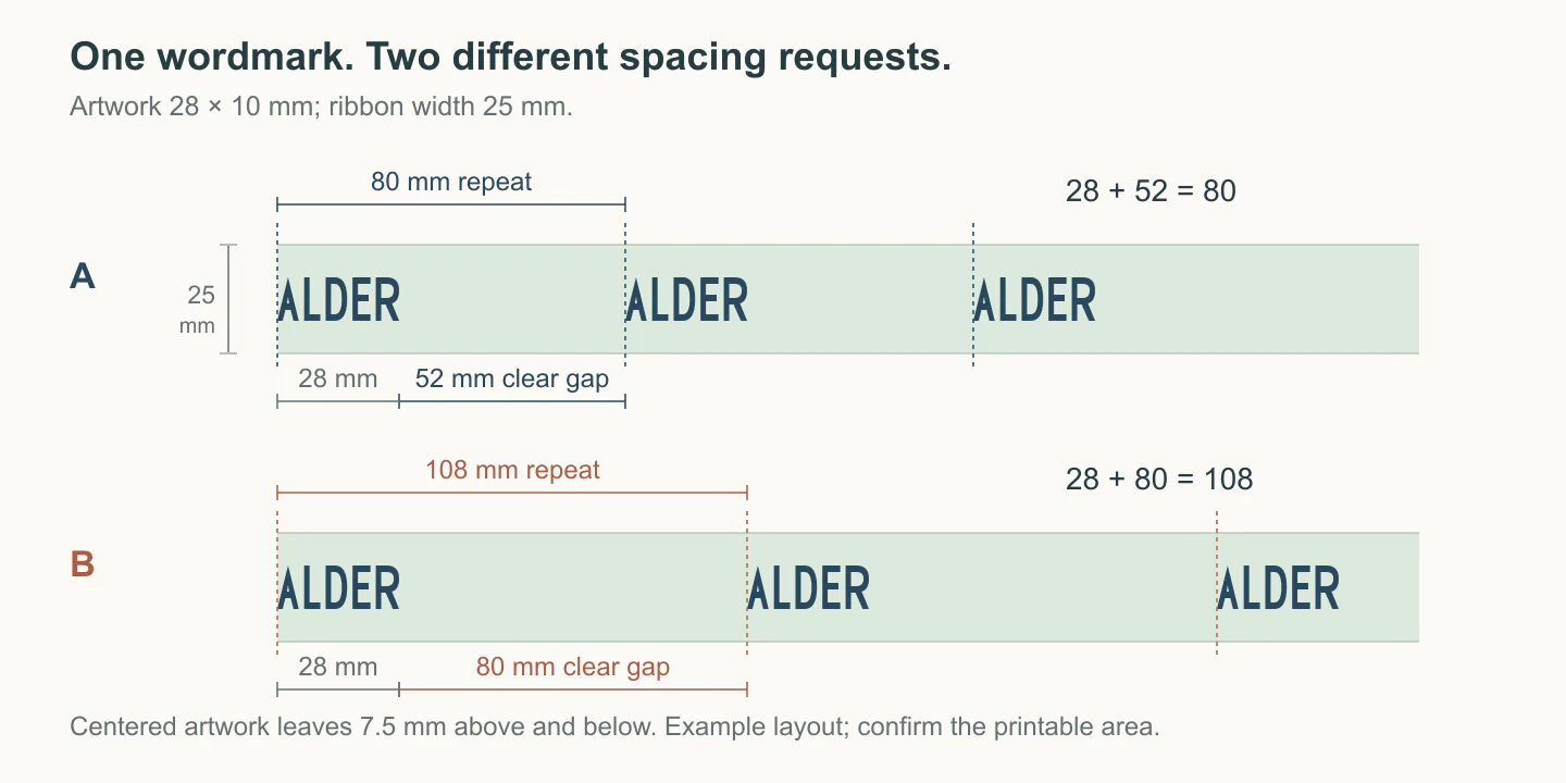
Example dimensions: the repeat includes the artwork and clear gap. Edge clearance is shown separately.
For a wordmark followed by a star, measure the whole group and its following gap. Keep the internal space between the word and star separate from the gap between repeated groups.
These are layout dimensions; the supplier must still review the printable area and detail for the selected material and method. For the proportions of a logo within the band, see How to Choose the Right Ribbon Width.
Check where the print lands after cutting
Equal cut lengths do not necessarily begin with the same part of a repeating design. Suppose a roll has an 80 mm repeat and each package uses a 1,180 mm cut. Each cut contains 14 repeats plus 60 mm. Starting the first cut at the beginning of a repeat, consecutive pieces begin at positions 0, 60, 40 and 20 mm within the repeat; the fifth returns to 0. The cutting length is consistent, while the artwork position changes.
A 1,200 mm cut contains 15 complete repeats, so its start position stays the same in an ideal, uniform 80 mm repeat. But adding 20 mm only helps if that length also works for the wrap and bow. The logo still has to be aligned with the lid.
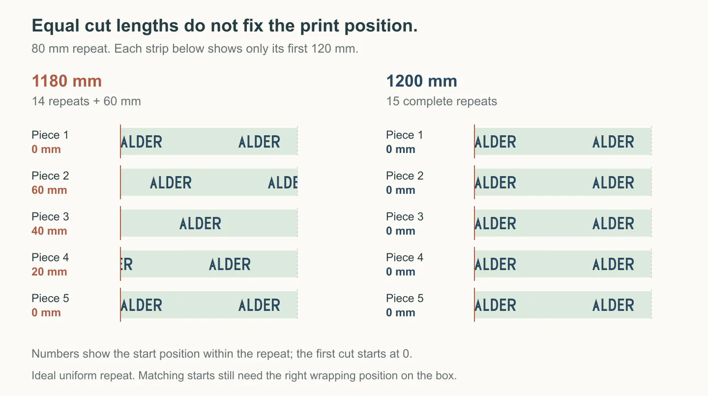
Only the first 120 mm of each cut is shown. On an ideal 80 mm repeat, 1,180 mm cuts move through four starting positions; 1,200 mm cuts keep the same position. Matching starts still need the right wrapping position on the box.
For a centered logo, agree on the repeat, the cut start and the wrapping method together. Include any offcuts used to align the print. Then use the quantity guide to calculate the order from the actual cuts.
Try the layout at its actual size
Print the layout at 100% and verify one labeled dimension with a ruler; “fit to page” may change the scale. Wrap a paper strip around the actual package and mark the folds, visible face and hidden overlap. For a bow, use the intended ribbon to establish the shape, then place the lettering against its exposed areas.
Read the smallest letters at the distance they will be seen: in the hand for a favor, from the approach for an entrance display. A physical sample then lets you judge color contrast, reflective foil and small details on the selected surface. If a fine line fills in or tiny lettering becomes unreadable, simplify that part of the artwork or give it more room.
Send a design brief that shows the finished result
Send a marked photograph or drawing with the exact wording and chosen dimensions. Leave unresolved details as questions. For the small wordmark example, the brief could read:
Content: ALDER, using the attached approved wordmark.
Ribbon: proposed width 25 mm; material and decoration method to be confirmed from samples.
Artwork size: 28 mm along the ribbon × 10 mm across it, centered across the band.
Repeat: 80 mm from the left edge of one wordmark to the next; 52 mm clear gap.
Appearance: ivory ribbon with dark blue lettering.
Placement: one complete wordmark should be visible on the top of the box shown in the sketch, reading left to right from the customer’s view.
Please review: cut start, wrapping method, printable area and fine details before the layout is approved.
Send the best artwork or reference you already have with that brief. Our artwork file guide explains how to begin with a logo file, photograph or idea through Christmas ribbon examples. When the design becomes a sample, use the sample approval guide to record the wording, layout and finish you actually approve.
To discuss a design with YiTuo, send the logo or exact wording with a photograph of its intended use. Mark the part that must remain visible and include the package or display dimensions. That is enough to begin working on a layout that fits the finished piece.
Discuss a real requirement
Turn the reading into a practical next step.
Send a short note, product reference, photograph, swatch or tech pack. Technical feasibility, sampling, documentation and production terms are confirmed after review.
Related products: Christmas Snowflake and Typographic Printed Ribbon for Gift Wrapping · Santa Claus Snowman and Reindeer Printed Grosgrain Ribbon for Gift Wrapping · Festive Gold Foil Printed Ribbon for Holiday Gift Wrapping
Start an inquiry